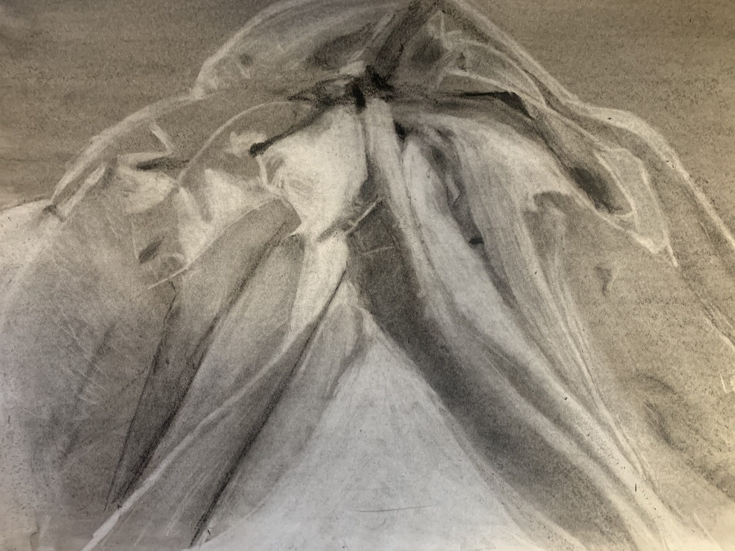
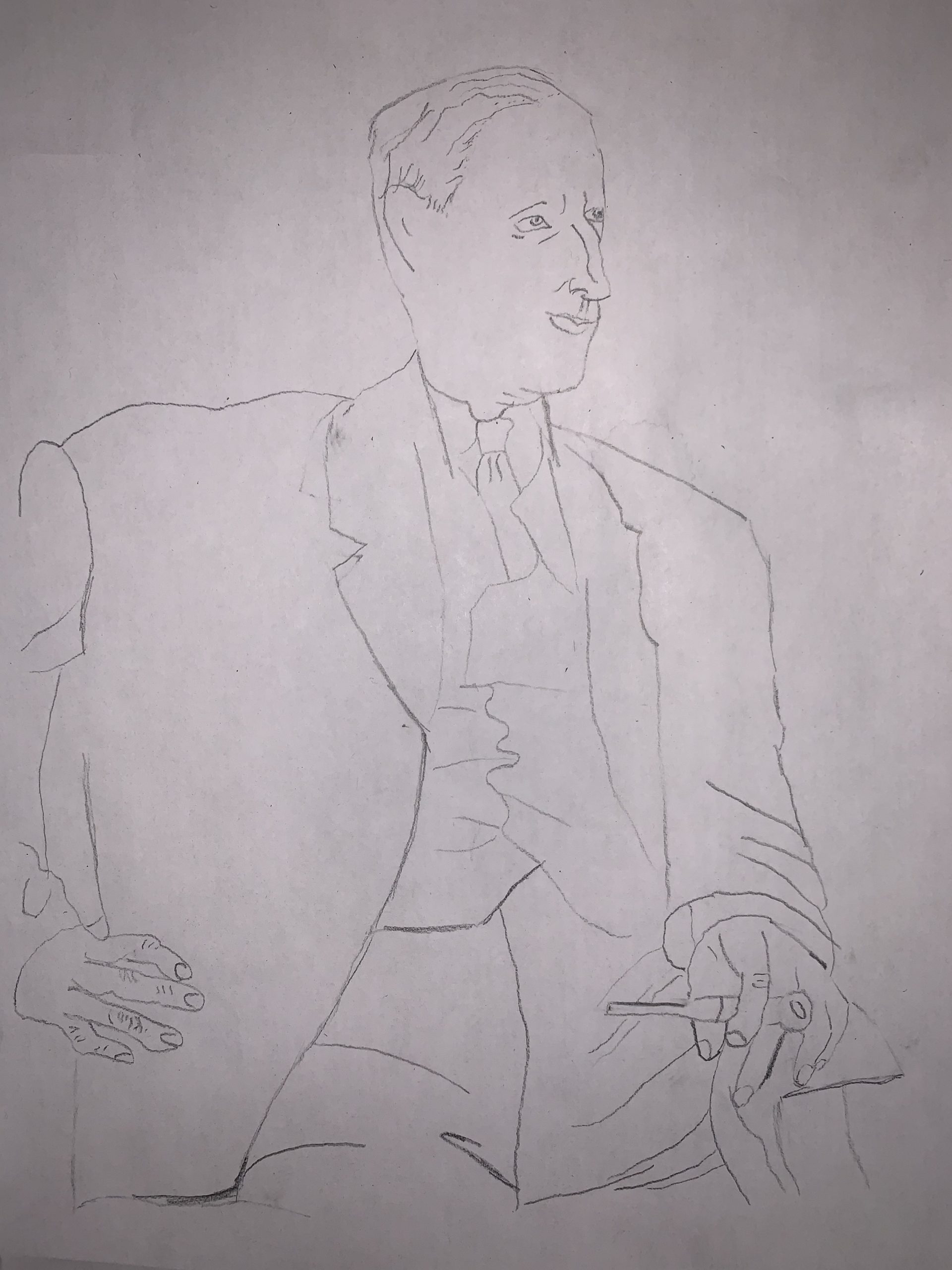
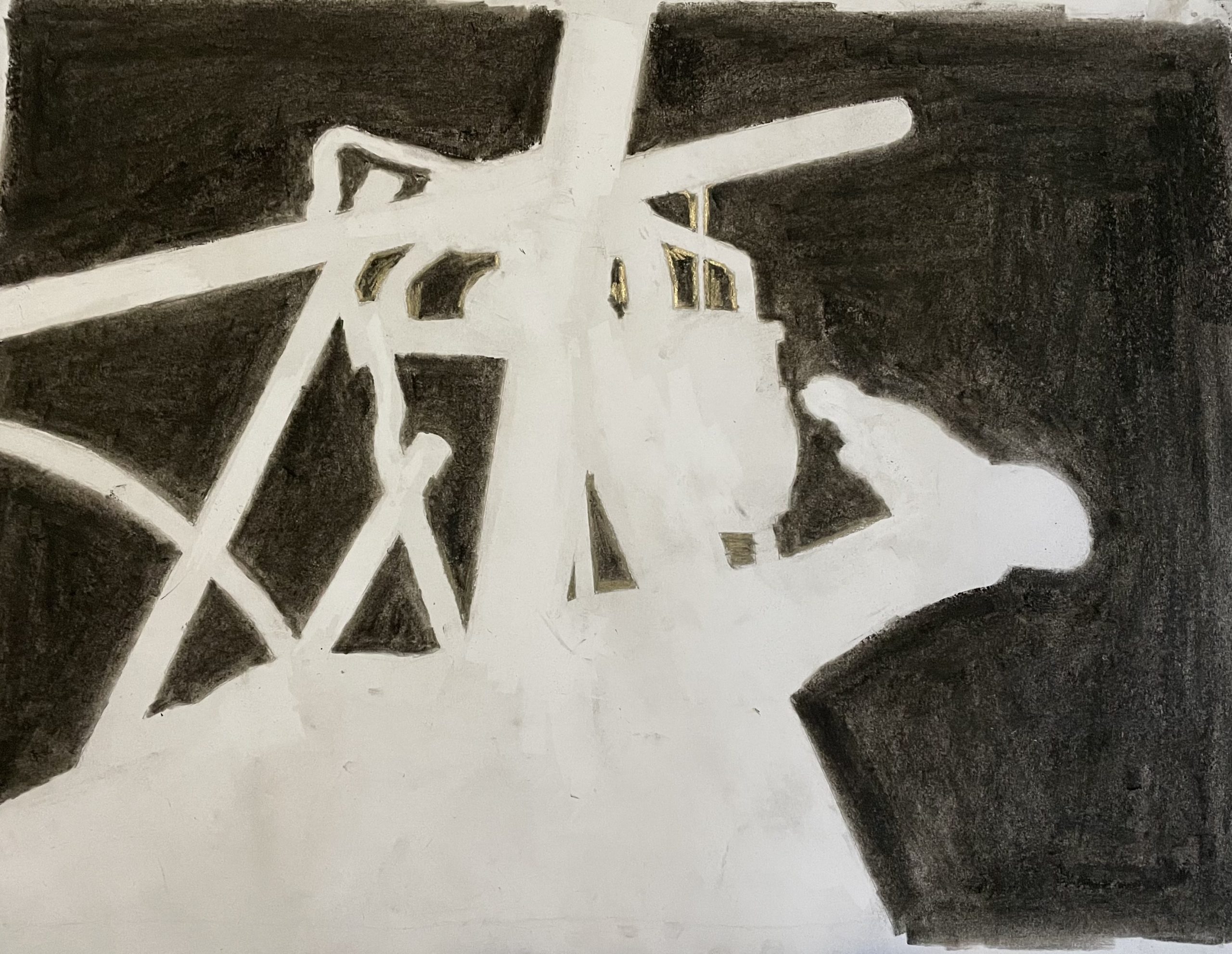
Connor Wackerman, Fabric Drawing
Humpty Dumpty Story Project
For this project my drawing will be based off the story of Humpty Dumpty. I selected Humpty Dumpty because of the nostalgia it holds in my life and the metaphor included in the story is applicable to infinite things in our life. The change in the story I will be representing through my art is that instead of Humpty Dumpty falling to the ground and being helped by horses and men, there is just a cracked egg next to a wall. It is supposed to represent what would actually happen if an egg fell off a wall. I want to make the egg look very deserted and lonely because the egg did not get the help that was expected. If you fall off a wall, sometimes no one will be there to help you, and in a simplistic and minimalistic way, that is what I want my work to demonstrate. The view, with the cracked egg laying in the grass as the centerpiece, will be at such an angle that it will look like the egg had just fallen from the tall wall that lies near it.
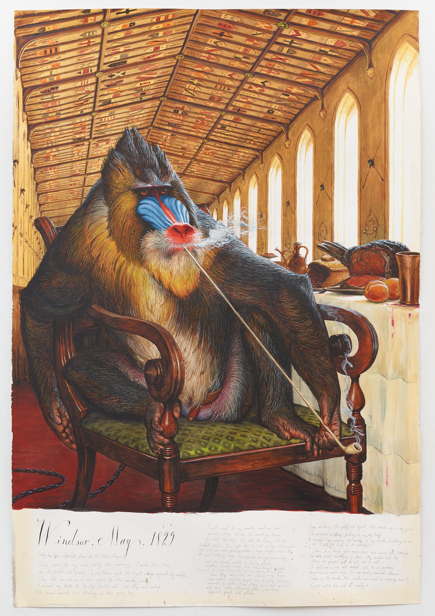
Walton Ford, Windsor, May, 1829
Immediate Response
After researching Walton Ford’s works, this piece stood out to me. The image captures a monkey living in luxury as he is found smoking a peice pipe and has all the food he would need in the world on the table across from him. It looks like he is reflecting outside of the window, reflecting at the sophisticated life he has had and experiences he has made, but still he is found chained. In Walton Ford’s work, it seems like he likes to visualize the pain of animals so humans can take away not a feeling guilt but also empathy.
Objective Description
In this portrait of a mandrill, instead of the monkey being in its natural habitat in the jungle, it seems that he is in the opposite, a high class dinning hall that seems like it is only suited for nobility. The mandrill takes up most of the page as he lously sits on a fancy wooden chair enjoying his long and slim piece pipe that almost takes up the length of the whole page. His eyes are locked in on something in the distance ahead of him but he can’t do anything becuase of the chain around his waist, which seems to be hidden by artists. On the long the ceiling above him there are thousdands of different naval/sailing flags that seem to go on endlessly and below on the white clothed table there are some of the finest meats and goods that any human of the time could get their hands on. Becuase of the windows lining down the hall, the lighting in the room appears as natural as possible and it gives the piece very smooth and relaxing colors.
Technical Decisions
This realistic oil painting truly makes you feel like you are in that dinning hall with the obese monkey. You can see every corner of the room, every expression on the monkeys face, and every crisp detail of the food beside him. The time is really well expressed in the detail of the inanimate objects around the monkey and it really sets the scene for this 1800’s style portrait.
The Work in the World
This painting revolvesaround the monkey in chains. He is tied up and there is nothing he can do but clearly he is an animal and is meant to be set free. In alot of his works, Ford often speaks out against animal cruelty in his works by exploiting the animals behavior and making it appear very human like. This is meant to prove that we relate to animals just as much relate ourselves to other people.
The Story it Tells
In Walton’s works, he will often give a back story to the main animal in the portrait. As you can see below the painting there is a small curvise blurb that is meant to really personify the animal and in this case, it really makes the monkey seem like he has “been places, and has seen many things”. The most profound effect this painting has on me is the sophistcation the artist wants to give the monkey. If you were to replace the monkey with a human you can see why the artist choose a monkey rather than a different animal. He is comparing nobility and class with a monkey who seems like he is just letting time pass away and watching the world go by.
Zach Fedor
Zach Fedor

Title of Event: Artist Interview with Samek Art Museum Director
Date and time of event: Filmed August 25 2020
Location of Event: Online
Type of Event: Artist Interview
1.) Provide a brief detail-oriented technical description or summary of the event you attended. (This section should remain journalistic and should not be reflective of your opinion.)
In this interview Samek Art Museum Director, Richard Rinehart, interviews artist, Adam DelMarcelle, about how personal loss due to the opioid crisis caused him to devote his art and time to “confronting the opioid crisis”. He does this by sharing anecdotes about his experiences and sharing with the Richard Rinehart the things and people he has become involved with.
2.) Use the section below to write a well-structured paragraph focusing on your personal critical insight / response to the event. How did you interpret or react to what was presented to you?
I thought Adam DelMarcelle did a wonderful job explaining his art and how art in general can itself cause a call for social change. His story about his loss and how that jump started a new chapter of his work was very inspiring and showed that from lowest lows something can emerge. In this case being his art and his connection with groups like safe injection groups that help protect the safety of drug users.
3.) What information, ideas, images, etc. most impressed you and why?
I found it interesting what Adam DelMarcelle said about drug use. Specifically when he was talking about how no “border-wall” or “sea-wall” could be enough of a barrier to keep drugs out of the United states and how drug users are normal people in our society. It made me really think about how prevalent and widespread the drug problem I our country is.
4.) Overall, how would you rate this event (10 being the most worthwhile)?
(10 / 9 / 8 / 7 / 6 / 5 / 4 / 3 / 2 / 1 )
I rate the event an 8.
5.) Justify your rating in the question above:
I decided to rate the event an 8 because in the time of COVID it is interesting to see how other people are dealing with the experience. Many people’s jobs got shut down and pushed back, but for an artist they can continue to create and inspire. I thought Adam DelMarcelle brought awareness to the opioid crisis in a very effective way that will hopefully reach and inspire others. My only reason for a not perfect rating is that the event is online, and I always think an in person event is more worthwhile.
Immediate Response
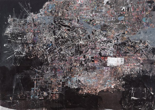
After finding Mark Bradfords, A Truly Rich Man Is One Whose Children Run Into His Arms Even When His Hands are Empty Piece, I was reminded of a birds eye view of a major city. It drove me back to the days of me standing on a subway in the populous city of New York, only to be looking at the subway map on the wall of the train. While I know this is not a subway map, what I do see is clutter; grids of colors, lines and sections. I can’t decipher exactly what this portrays, but to me, it almost looks like a map of neighborhoods creating one mass city.
Objective Description
The piece itself is a rectangle, however within the rectangle is an irregular shaped region; similar to a splotch. Within the region, comprising 80% of the piece, are multiple lines of color, intersecting each other in all directions. Beyond the boundaries is darkness and limited detail. From afar, it looks as if it is a clutter of blended shapes, lines and colors. Looking closely, you can decipher the shapes as rectangles, resembling buildings and the lines, resembling streets and avenues. Imagine a coastal city at night; street and office lights still lit, and the hustle of commuters very evident amidst the dark sky.
Technical Decisions
Bradford uses a variety of urban threads, like scraps from magazines, advertisements and even billboards. He layers and intertwines the materials, creating a very abstract collage. Bradfords artwork resembles himself in how he is 6’8. Almost all of his pieces take up an entire wall. The contrast between the mass in the middle and the dark of the surrounding area on the left side and bottom is what makes me think about lights at night. I think this piece is both harmonic and dissonant. Initially looking at it, you can’t exactly pinpoint what it is, which makes it overwhelming. However, after closely looking at the piece, you slowly pick up on the shapes and colors, which allows you to appreciate it more.
The Work In the World
By now, I have an instilled image of the artwork reflecting a city. For all of my life, I have lived roughly an hour from New York City, which allowed me to interpret the image in a more familiar way. Additionally, this piece to me resembles the city post 911 as the city remained lost and confused which is represented in the artwork as you don’t know exactly what’s going on. Looking at this piece reflects my first perspective of being in the city. The piece is almost intimidating as I could easily get lost within it.
The Story It Tells
Narrowing down my ideas and research, I think this piece portrays a map of where he grew up and where he lives today. In 1981, Bradford came out as gay, an identity he slowly discovered through his going to nightclubs and dancing. This collage paid homage to his upbringing; and where his mother worked tirelessly for him with her studio to provide for him. This piece takes pieces from his hometown and formulates a blurry image to represent the complexity of his upbringing struggling with race, poverty and his sexuality. From walking the streets of his hometown, Bradford collected materials and scraps around the area to turn it into something beautiful to reflect the positives and light of the place he has spent his whole life in.
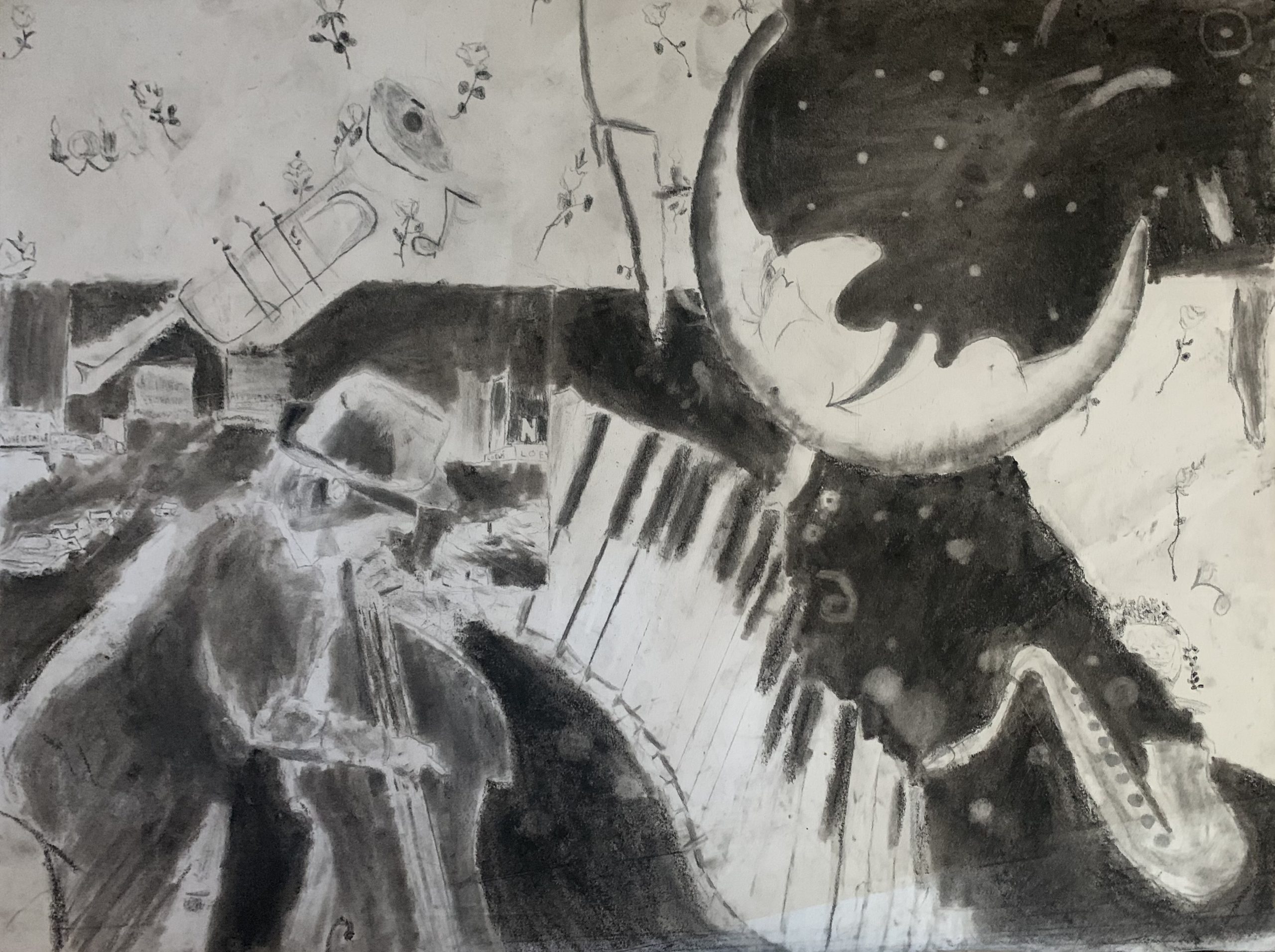
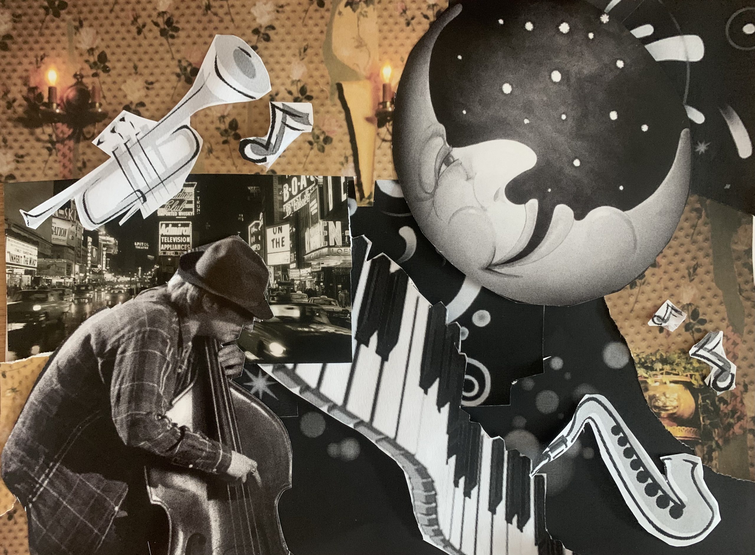
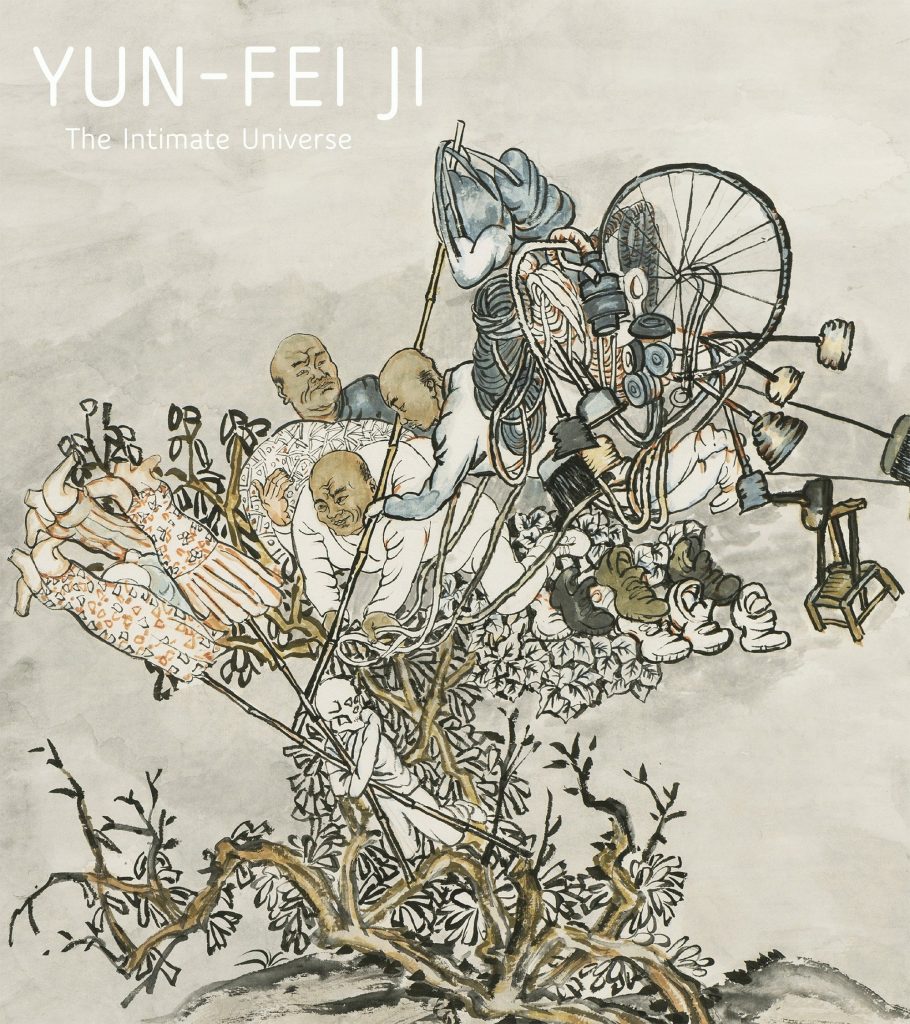
Tyler Fuhs, The Intimate Universe
Immediate
Originally seeing this piece of artwork made me think of a tornado. The way that the design is structured it made this piece look like everything is spinning. The piece to me looks hectic but it also is simplistic at the same time. The empty space around the artwork makes me focus onto the center of the artwork. The three guys in the middle draw most of the attention from the artwork. What I noticed last out of all of this piece is that it’s a depicted being on top of a tree. The name of this piece is what I noticed first and that intrigued me into looking into this artwork more.
Objective
The background is a blank grey and start at the bottom of the page is a small tree or plant growing but growing within the plant are a lot of different things. Starting from the bottom of the objects in the tree is a not completely colored in man with a not normal face that I can not describe. Above him are three men who look to be in pajamas hold a bamboo pole some string and cloth. To the left of these men are some women mannequins without heads, arms, and legs, on bamboo poles. To the right of the men is lots of string, a bike tire, plunger like things, a chair and some shoes. That is the extent of the artwork and its all within this small plant growing.
Technical
Composition
This drawing is a very slow-moving drawing. I looked at this drawing saw the general picture then slowly moved through each part admiring the details. There is not a flow to it because its just a pile. The central design in this drawing, where I put most of my attention to is the three men in the middle of the page. This piece is harmonic even though it is a little cluttered. This piece brings peace to me. The color scheme the artist used in this artwork is very calming.
Work in the World
This piece has a lot of basic man needs. The bike to the clothing to the men working are all needs of a basic person. The men plus the shoes illustrate how these people are the average person trying to work. There are piles of yarn or fabric that a man is pulling away with. These seem to relate to how the average person works and lives.
The Story it Tells
The meaning of this artwork is to show how the men provide for their families. This artwork illustrates how and what they do to provide from the fabric to the poles to the shoes and dresses and finally to the not finished person at the bottom. They are trying to build the person that has not been drawn at the bottom of the page. This illustrates also what they can and cannot provide. The person at the bottom is holding the dresses and together the three of them are trying to provide what they can for the person. The bike tire as I can see now is makeshift spinning machine and the three of them are trying to provide the person at the bottom of the page the dress that they have been holding onto.
Drawn By Yun-Fei Ji
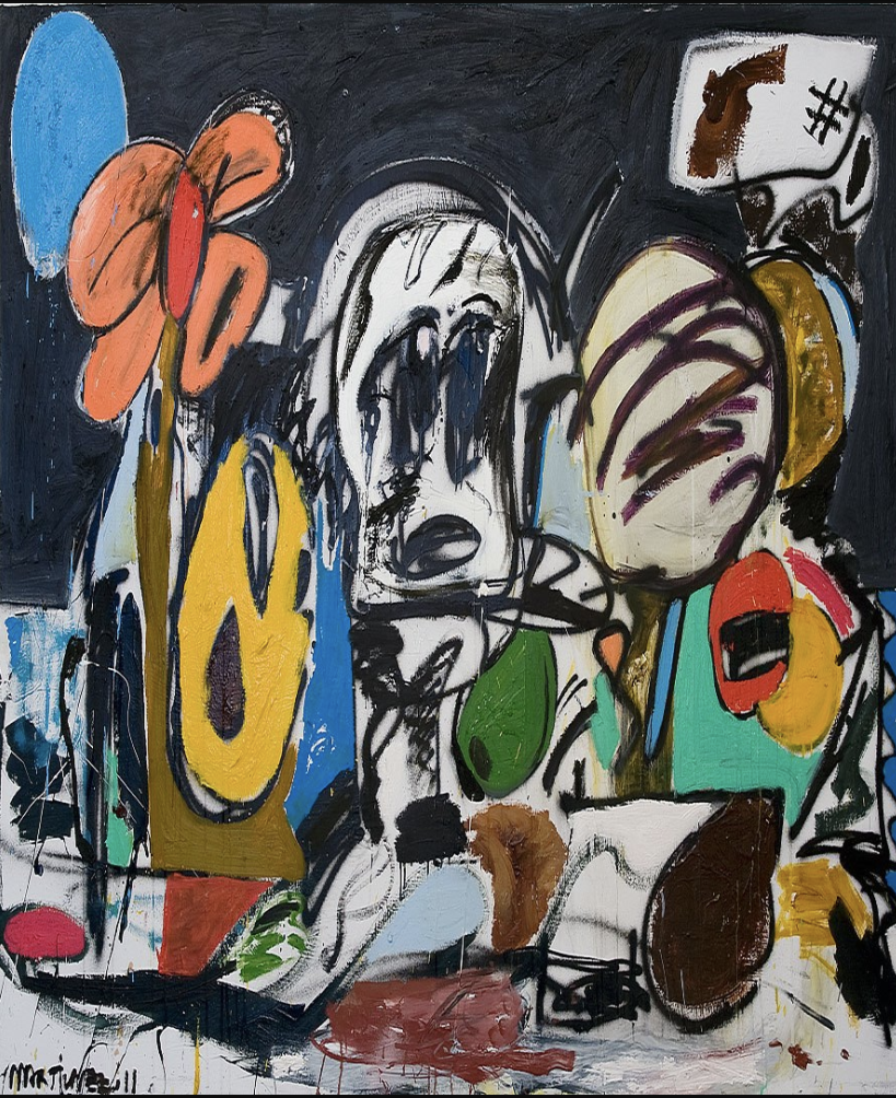
Immediate Response
At first glance, Dreamscape 2 by Eddie Martinez seemed like graffiti you would look at quickly while driving through the city. It’s color and shapes have elements of street style, but with details and objects that catch the viewer’s attention and make them take a second look. The contrast of the dark background makes the vibrant colors even more distinguishable and interesting. The objects included in the piece seemed “familiarly unfamiliar” to me. I had to look deeper into the painting to recognize all of the objects painted. The seemingly random objects included were very dreamlike in that they appear vague and having no relation, but distinguishable.
Objective Description
Eddie Martinez’s, Dreamscape 2, is an assortment of various objects surrounding a person’s head, as if they are overwhelming the subject of the painting. The objects – an emoji, lips, flower, and olive, to name a few – are dominantly in primary colors, with black and white outlines that help distinguish one from another. The objects are crammed together overlapping and covering part of each other. The head, which is devoid of any bright color apart from dark blue eyes, is placed in front of all these objects. The head is very abstract with lines and and unique shapes causing the viewer to question what they are looking at. The background on the top half of the piece is a dark navy and the bottom half is a white/grey color.
Technical Decisions
Dreamscape 2 has a false harmonic composition. The viewer is immediately drawn to the vivid colors and the creative and unique images included in the piece. These components give off positive and comforting feelings and make the painting seem innocent and as if it could have been drawn by a child. The longer you study the details, however, you begin to notice the subject and the objects around them. You begin to realize the objects are coming closer and closer to the subject, cramming into and overwhelming them. This conveys negative emotions like stress and the lack of certainty that gives this piece a dissonant composition.
The Work in the World
Martinez got his start in art through graffiti when he was younger. His current pieces have moved away from pure graffiti, but still have similar elements and techniques. Graffiti is often seen as ugly and referred to as an “eyesore”. This type of art is often illegal and seen as destructive, prompting people to want to remove it when it appears. The similarity to graffiti and street art Martinez includes in his work relates back to the artistic roots of graffiti. He makes people see a different side to this street art style and urges viewers to look at the beauty in an artform that is commonly known as ugly and destructive.
The Story it Tells
Martinez says, in his interview, that he likes to leave the interpretation of his art in the eyes of the viewer. My interpretation of the work is that you must live in the present. The colorless head with no clear lines represents negative emotions and being distracted. The subtly colored eyes suggest the subject is looking into something not in his world, like a dream. Dreams have elements of your real life present within them because they are your mind’s way of processing what you are living through. While dreams can be colorful and tempting, you can never stay forever. No matter how enticing it is to stay permanently in your own dream world, the longer you stay the more dangerous and overwhelming it gets. You must alway come back to reality no matter how bleak and grey it may seem.
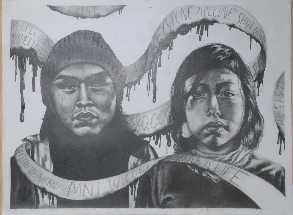
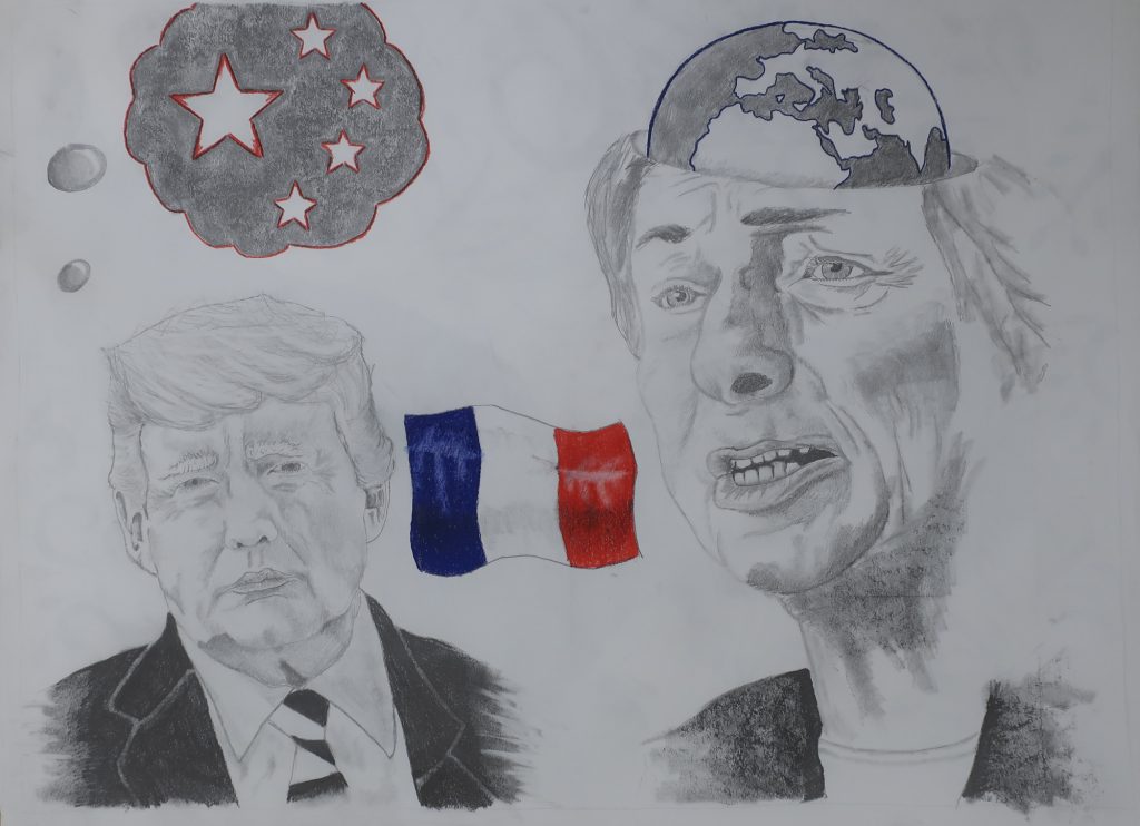
Tibet was taken over by China in the late 1950s, and ever since then, we’ve become a minority on our own land. They stripped us from the right to pray, and the right to free speech. One of the main reasons China wants control over Tibet is to take advantage of our r resources. Tibet has a lot of mountains, minerals, and fresh water. China doesn’t want Tibetans to practice their religion (Tibetan Buddhism), and therefore destroy monasteries. They don’t want the Tibetan culture to stay alive so they force Tibetans to speak anything but Chinese Mandarin in schools. Looking at the oppression Tibetans face in China, I wanted to portray that in my political drawing. My first sketch shows a big machine that is digging in the ground. This represents all the resources that China is depleting in Tibet. Another sketch shows a girl with prayer flags as hair, but her mouth is covered with Chinese flags to represent the restriction of free speech, etc.
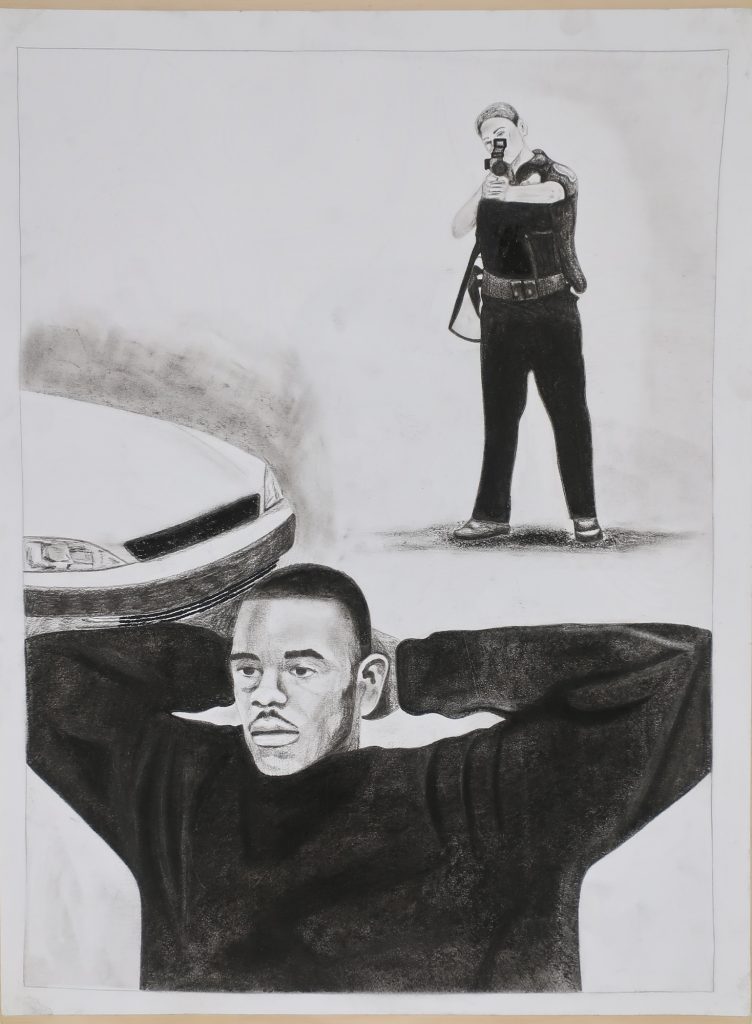
One paradox that I find to be most prevalent in human society is how dependent we are on nature and the earth in general, yet our superiority complex as humans is causing us to degrade these valuable resources. Humans came from the natural world and we are part of the animal kingdom, yet we keep trying to fight our roots by domesticating and conquering the wild things around us. We try so hard to be innovative and move towards the future, thinking it is the right thing to do, yet we are destroying our past and our life support system in the process. Old cultures are being forgotten as new cities are being built, we are cutting and burning down the trees that give earth life, and we claim to do these things for the sake of advancing our society and fulfilling our quest as humans to conquer the earth we call home.
The following article is from: http://www.streetdirectory.com/travel_guide/187781/communications/creative_presentation_openers_that_work.html
A great way to begin a presentation is with an attention-getting device that will get the audience EXCITED about listening to the rest of your presentation. Some of the best ways I have found to capture the audience’s attention are:
1. Rhetorical Question – A rhetorical question is a question to which no response is needed. Rhetorical questions are designed to be thought provoking, rather than answered out loud. An example of a rhetorical question might be, “If you were trapped on an island and could only have three things, what three things would you choose?” Not only does the audience begin thinking about how they would answer your question—they wonder how this will tie into the presentation (which by the way, it must) and suddenly—you’ve got them!
2. Relevant Story – Beginning a presentation with a story that directly relates to the topic is another great way to get the audience’s attention. A good story engages our audience’s hearts and minds and immediately draws them in. Make sure that the story is short (using a long story in the introduction can compromise the flow of the presentation) and makes a strong point. Here’s an example of an introductory story used for a presentation on the benefits of a 24 hour Nurse Line. “All of us have had frightening medical situations where the help of a registered nurse could come in handy. Let me tell you about a young mother, Marie, who was terrified when her two-month old infant son Sam woke up screaming in the middle of the night. He was burning up with a high fever and Marie didn’t know what to do. So she called the Nurse Line and they directed her to put him in a cool bath to bring his body temperature down. They stayed on the line with her until she was comfortable that she could handle the situation herself. Imagine having that kind of support available to you at all times of the day and night.”
3. Analogy – An analogy compares the known to the unknown, helping the audience better understand the unknown. When properly developed and explained, an analogy can be an interesting presentation opener. Here’s an analogy example… “Continuing to use this technology is like being on a lake in a rowboat full of holes—instead of patching the holes, all your time is consumed with scooping the water out of the boat.” You may not understand the technology, but now you know unequivocally, that it is like a sinking ship!
4. Humorous Anecdote – Humor is one of the BEST ways to win an audience over and get them enthusiastic about you and your presentation. Humor enhances the audience’s positive perception of you. When an audience laughs with you, chances are good they are also FOR YOU! The safest type of humor is stories or anecdotes that are uniquely yours. The problems you had traveling to get to your presentation make humorous presentation stories. Your dinner disaster is always good for a presentation laugh. One reminder worth mentioning–only use humor when you can relate it to the subject matter—irrelevant jokes are not suitable presentation openers. Here’s an example of a humorous anecdote… “There is nothing more humbling than the honest opinion of a five year old. I was feeling really good about this outfit this morning (even preening a little in front of the mirror) when my five year old daughter came up to me and said, mommy, are you going to wear that table cloth to work?”
5. Curiosity – Provoking the audience’s sense of curiosity can also help you capture their attention. When we are curious about something, we tend to listen more closely to see how it works out. The TV news trailers you see during Prime Time television often use curiosity to try to entice you into staying up and watching the late news. “Tonight at 11:00, find out what vitamin combination can save your life.” In the presentation realm, you might use a more subtle tactic, “Today, I’m going to tell you three important things that I guarantee will change the way you do business forever…” Because they are curious, the audience will pay close attention to see what those things are.
6. Gimmick – The sole purpose of a gimmick is to capture the audience’s attention, so it makes sense that beginning with a gimmick is a good strategy. An example of a gimmick might be… A presenter who is going to speak about the benefits of a paperless office begins the presentation by dramatically crumbling papers and throwing them away. He/She then asks the audience to throw away all the paper that has been planted in front of them. Note that everyone loves a gimmick, as long as it is in good taste.
Remember, incorporating a good attention-getter into the introduction of your presentation can mean the difference between being MEMORABLE or FORGETTABLE.